The mysterious 84.51˚: the cryptic name behind The Kroger Company of stores' data-science behemoth, which unlocks CPG's (Consumer Package Goods) customer behavior insights, retail media/ad purchasing, loyalty rewards, and a host of innovative data-driven experiments.
It might go without saying that designing for data tables, report generation, or spending boat-loads of money to reach potential shoppers isn't as "sexy" as designing for the latest in UI trends, addictive doom-scrolling, or the dopamine rush of having a post go viral.
Yet, UX design is more than pretty pictures, clever interactions, or gamified achievements. It's about gathering the knowledge needed to advocate for the user, incorporate best business practices, and implement real solutions that make lives easier.
Just a heads up!
Much of what I worked on at 84.51˚ is behind an NDA and contains trade secrets. I did my best to showcase and story-tell my work knowing the limitations. Please forgive the often lo-fidelity, conceptual imagery. Contact Me if you wish to learn more!Actually, the question should be: What did we do at 84.51˚? As I could get nothing accomplished (or at least of any value) without the people around me. Whether collaborating with other designers and managers, engaging our engineers for their insight, or leaning on our user base for feedback. From discovery to delivery, the evolution of our products required an entire crew to make it happen.
Yet, here are a few areas I was able to stretch myself:
Product Design | User Research | Service Design | Product Growth
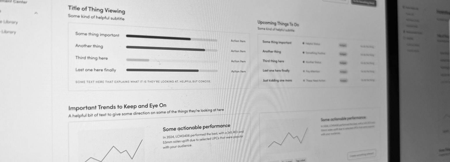
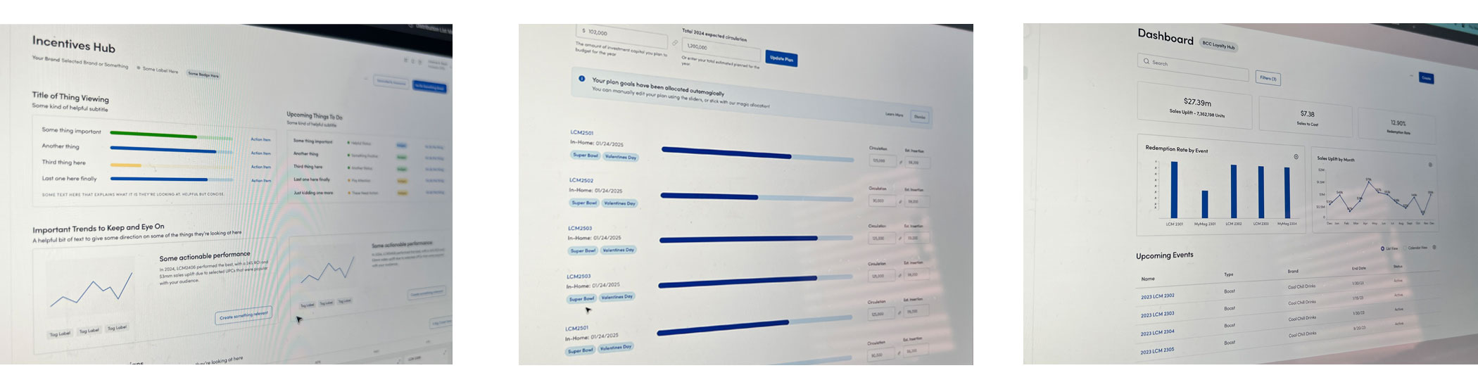
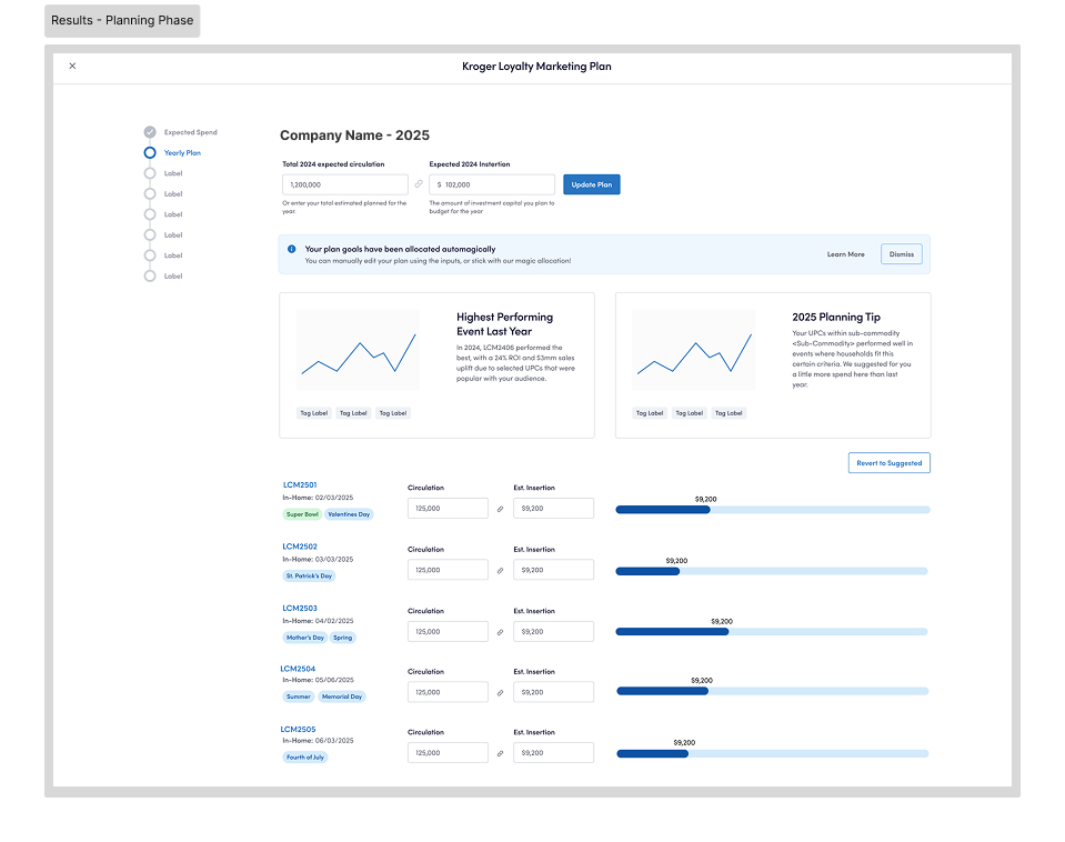
For the majority of my time at 84.51˚, I worked on an application (84.51˚ Prism) which enabled CPGs to reach and reward shoppers with coupons and other incentives for their loyalty to a particular brand.
Using the technology behind 84.51˚ Prism, these incentives were distributed to the right households at the right time; ensuring relevant offers for relevant recipients.
Yet, buying and delivering paper coupons is (or was) kind of an old game. How does a data-giant like 84.51˚ bring something so analog into the digital realm?
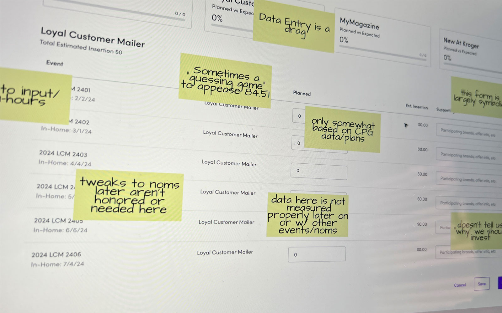
Leading a team of design, product, and stakeholders, we sought to understand what users were feeling and thinking while planning and activating loyalty rewards for their customers.
For years, our users were expected to use our excel-esque system of planning and delivery for paper coupons.
It didn't take more than a few interviews to catch a few running themes.

We used UserZoom to create a study in which participants ranked, using a Likert scale, from 'very valuable' to 'not valuable at all' features and capabilities we heard from our previous user feedback sessions.
What we learned was actually surprising to us. We went in with some assumptions, and the results blew those assumptions out of the water.
AI capabilities to do their job for them, smarter sciences, and "data-driven insights" were there, but actually ranked pretty low.
Our users, almost unanimously, desired a few simple changes: to quickly create things, a more conventional IA, and a workflow that just makes sense. Our experience wasn't even bad currently; it just wasn't intuitive.
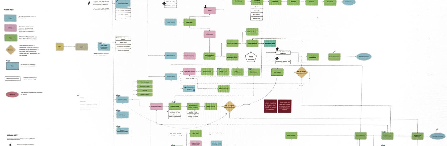
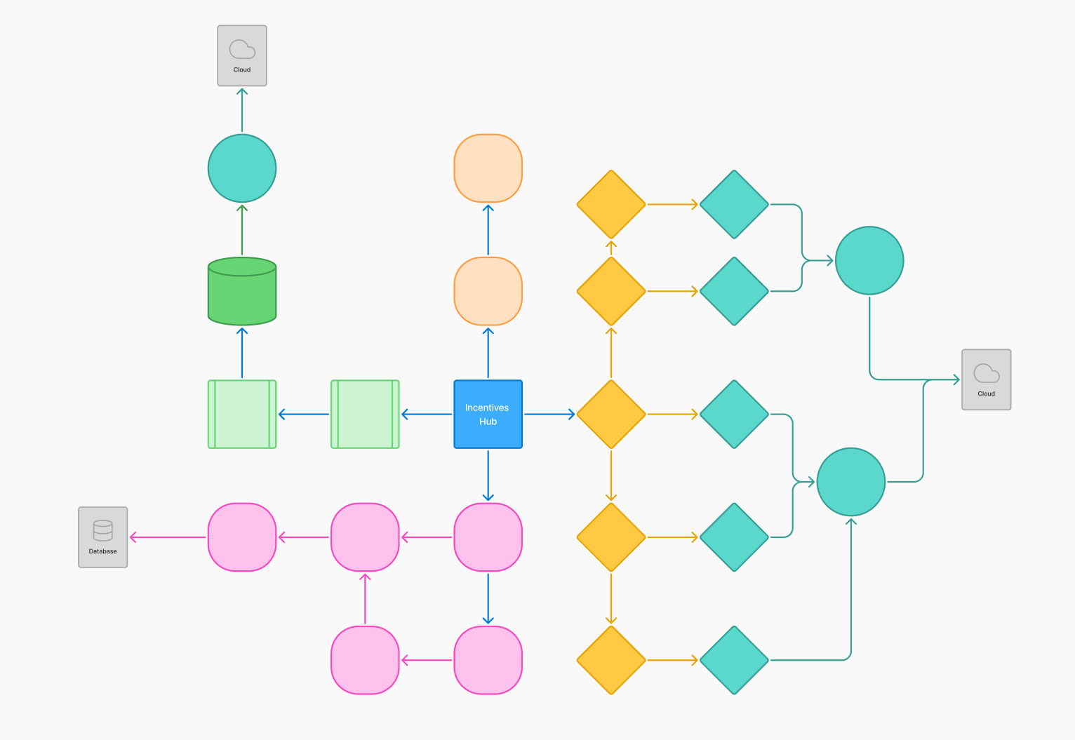
I took on the task of auditing our capabilities and the information architecture that our users had to go through to accomplish their tasks. Realizing quickly that our part of the app was pieced together over the years, and that there wasn't a cohesive method to the madness.
What made matters worse, is that our internal colleagues who use the app had a very different set of support around them than our external users, who, when stuck on something, had to figure it out on their own.
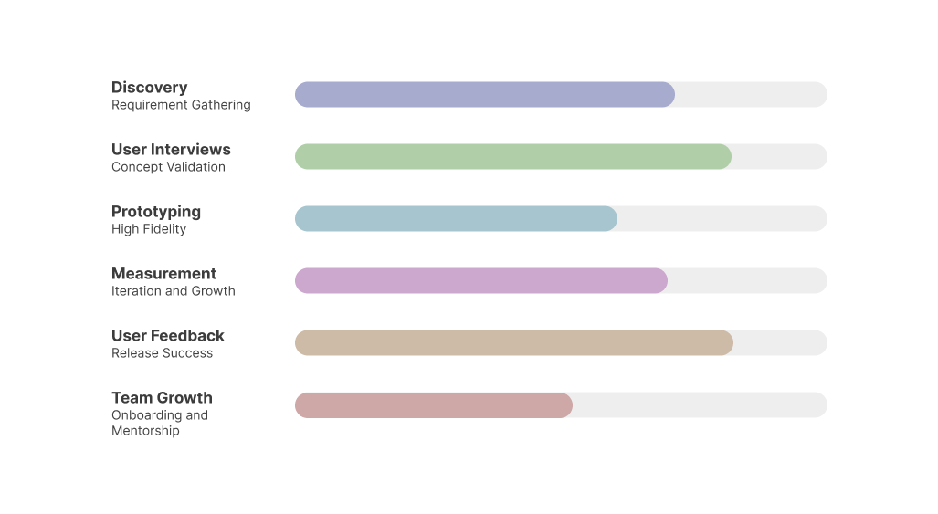
We wondered, "why couldn't our app simply guide our users through the process? All the previous research we had done led us to remapping the entire experience from the ground up - implementing a streamlined hub-and-spoke model.
Thus, the Incentives Hub was born.
One of the most joyful aspects of what I do is having the opportunity to lead and mentor younger talent in their journey. During this project, one of our co-ops spent a few weeks with me and our team for this endeavor. Of course, I used this as an opportunity to give her the space to own much of it for her capstone project.
Collaborating together, we were able to gather the user research, stakeholder validation, engineering feasibility suggestions, and the business objectives and transform a once very manual process, into a largely automated, user-friendly design.
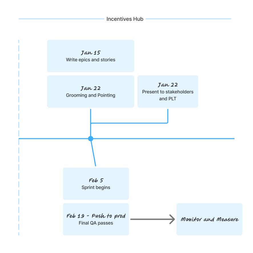
After presenting our research and designs to leadership and getting the thumbs up, it was time to get the ball rolling.
Working with the product and engineering team, we organized our plan-of-action in Jira and ProductBoard. Seeing it visibly in a timeline format made it almost feel real.
We used group voting to determine the most necessary features and were able to begin writing user stories around what we knew our merchants needed.
User feedback, business leadership, and a solid team would ensure our metrics reflected not only an increase in productivity, but less frustration along the way.
OKRs are a way to establish success goals and determine relative success metrics against them.
Some of these OKRs achieved were: